
How Business Models Dictate Canada Web Design: A Front-to-Back Strategy
Discover how different business models shape Canada Web Design. Learn practical site architecture strategies for B2B, e-commerce, and service companies.

Back in 2018, I made a costly mistake with a new client project. A boutique management consulting firm had hired me to overhaul their outdated online presence. At the time, I had spent months building fast-paced e-commerce sites, so I brought those same design habits into the project. I built a sleek, minimal layout with rapid call to action buttons, large hero banners, and very little written text above the scroll line. It looked like an award-winning design agency showcase. However, within thirty days of launching, their inbound inquiry rate dropped by forty percent. The problem was not the visual quality. The problem was a complete mismatch between the layout style and how their prospective clients actually made buying decisions.
That project forced me to reconsider how I approach Canada Web Design across different commercial sectors. A customer buying custom sneakers makes a choice in seconds based on visual aesthetics and price point. An executive hiring a corporate consulting team spends three weeks evaluating credentials, reading whitepapers, and discussing options with an internal selection committee. When you treat every website like a standardized canvas, you waste money and hurt performance. Over the last decade, I have designed digital platforms for local service contractors, specialized manufacturing brands, subscription tools, and online retail stores. Every business model demands a unique layout, tailored user flows, and specific content hierarchy.
High-Ticket B2B Services: Building Trust Before the Pitch
When selling high-value business services, your website is not an automated salesperson designed to close transactions on the spot. Instead, it functions as a validation engine. Prospective clients visit your site to verify that your company is legitimate, capable, and trustworthy before they ever agree to book a thirty-minute discovery call.
In this category, effective Canada Web Design requires placing credibility signals at the very top of your page hierarchy. If you hide your leadership team behind stock photography or refuse to explain your process until someone fills out a complex lead form, visitors will leave immediately. Frame your primary layout around real human faces, client logos, verifiable industry credentials, and detailed case studies that highlight specific business outcomes.
Corporate buyers often pass your site around to legal departments, procurement officers, and operational directors. That means your pages must answer hard questions about security compliance, project timelines, and scope management. Including downloadable resources, such as technical guides or industry reports in exchange for an email address, lets you capture prospects who are early in their decision process and not yet ready to commit to a phone call.
High-Volume E-Commerce Requirements for Canada Web Design
E-commerce platforms operate on an entirely different set of psychological principles. Here, friction is your single biggest enemy. Every extra click, slow loading image, or hidden shipping policy reduces your overall conversion rate and directly cuts into profit margins.
When building retail sites, navigation simplicity is paramount. Keep your top-level category menu clean and intuitive so shoppers can navigate to a specific product category within two clicks. Search bars should feature auto-complete functionality and tolerate minor spelling errors, as a significant portion of high-intent buyers go straight to the search box.
Product detail pages need a strict content structure. Place high-resolution product photos, clear pricing, stock availability, and a direct Add to Cart button where users can see them immediately without scrolling. Place secondary information like care instructions, dimension charts, and customer reviews into expandable accordions lower down the page. Additionally, modern slide-out cart drawers that show shipping thresholds and related cross-sell items can boost average order value without interrupting the checkout process.
High-Urgency Local Services: Frictionless Action for Mobile Users
Consider how people interact with a local service business, such as an emergency plumber, commercial locksmith, or towing provider. The user is usually holding a mobile phone, experiencing an urgent problem, and looking for immediate help. They are not interested in reading a five-paragraph history of your family business or browsing through awards.
For these operational models, successful Canada Web Design revolves around immediate contact options and extreme clarity. Your primary call to action should be a prominent, tap-friendly phone button that stays sticky at the top or bottom of the screen as the user scrolls. Do not make users search through footers or separate contact pages just to find a phone number.
Form fields should be stripped down to the absolute essentials: name, phone number, and a brief drop-down menu for the issue type. Avoid using heavy video assets or complex script animations that slow down load times on mobile cellular networks. Embedding real Google reviews directly on the landing page offers instant social proof, assuring distressed customers that your technicians are reliable and nearby.
Subscription and Membership Platforms: Balancing Acquisition and Retention
Subscription platforms face a double challenge because their site architecture must cater to two distinct user groups simultaneously: prospective subscribers and existing account holders who log in daily.
When approaching subscription models in Canada Web Design, clean user segmentation is essential. Your homepage should focus entirely on prospective buyers, featuring clear pricing comparison tables that highlight key differences between tiers. Use plain language to describe features rather than obscure technical terms, and clearly indicate which plan offers the best value for specific customer needs.
For logged-in users, access to their personal dashboard, account settings, and billing portal should be immediate and effortless. A subtle login link in the header is standard, but you must also ensure the post-login experience is completely streamlined. If existing members struggle to navigate past marketing content to reach their account controls, frustration builds quickly, leading to higher cancellation rates.
Universal UX and Performance Standards
While different commercial structures demand unique layout choices, a few fundamental performance standards apply to all modern web projects regardless of industry.
- Page Speed Optimization: Compress image files using modern formats like WebP, defer non-essential scripts, and host your site on fast infrastructure. Delaying page load times hurts both conversion rates and search engine rankings.
- Typographic Clarity: Maintain strong contrast ratios between body text and background colors. Avoid tiny font sizes or light grey text colors that look modern but are difficult for users to read on mobile screens.
- Touch Accessibility: Ensure all interactive elements, including buttons, links, and form fields, have adequate spacing and physical size so mobile users can tap them easily without misclicking.
- Logical Hierarchy: Structure content using clear heading tags so users can skim pages quickly and find the exact information they need.
Implementing these foundational elements ensures that regardless of your specific industry, visitors experience a smooth, professional digital interaction that reflects well on your brand.
Aligning Digital Design with Business Reality
Before you hire a development team or start redesigning your existing platform, sit down and map out how your customers actually make purchasing decisions. Ask yourself what questions they need answered before they take action, what objections prevent them from converting, and what device they rely on most during their search.
Once you understand those buyer behaviors, build every single page around supporting that real customer journey. Avoid copying design trends from unrelated industries simply because they look modern or artistic. A strategy that works brilliantly for a direct-to-consumer fashion brand can easily ruin lead generation for a commercial legal firm or industrial supplier.
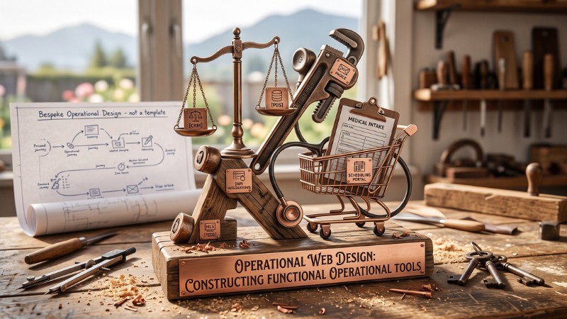
Smart Canada Web Design is not about winning creative awards or following short-lived visual trends. It is about constructing a reliable operational tool that serves your visitors, solves user friction, and delivers predictable business results year after year.
0 Comments