
Web Design for Different Businesses, Matching Your Site to How Customers Decide
Practical Web Design advice for different businesses, focused on how customers compare, hesitate, and choose before they contact you.

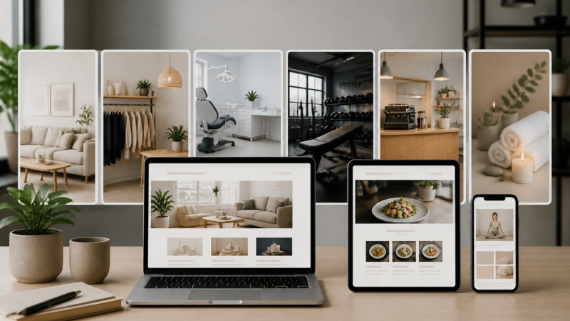
When people talk about Web Design for different businesses, the conversation often gets stuck on industry labels. Restaurant sites should look like this, law firm sites should look like that, ecommerce stores need this feature, and so on. I get why that happens, but in practice, I have found a different question matters more. How does your customer make up their mind when they are comparing you with other options?
That one shift changes almost everything. Two businesses in the same category can need very different sites if their customers make decisions in different ways. A family dentist in a tight local market does not need the same website approach as a cosmetic dental clinic where people compare photos, pricing, financing, and reputation for weeks before booking.
I have seen the same pattern across trades, consulting firms, clinics, retail brands, and local service businesses. The best sites are not only attractive, they are built around the moment a visitor starts asking, quietly and privately, “Why this business and not the other one?” Good Web Design should help answer that question before the person ever fills out a form.
Web Design should reflect how people compare options
Some buyers compare almost nothing. They need help now, they search, they glance at a few signals, and they call. Other buyers open eight tabs, send links to a partner, read reviews, check your policies, leave, come back three days later, and only then decide whether they trust you.
Those are completely different decision patterns. Yet I still see businesses using the same template logic, same page order, same generic hero section, same stock photos of smiling people in blazers. It looks fine for five seconds, but it does not help a real person choose.
When I work on a site, I like to ask what I call the comparison pressure question. What does a potential customer feel they must compare before they feel safe moving forward? Sometimes it is price. Sometimes it is expertise. Sometimes it is style. Sometimes it is convenience. Sometimes it is risk.
Once you know that, Web Design becomes less abstract. You are not arranging boxes on a screen. You are reducing uncertainty in the exact places where buyers hesitate.
The hidden cost of generic pages
A lot of business websites lose people not because they are ugly, but because they are vague. They say all the expected things, trusted service, quality work, customer satisfaction, years of experience, but they do not give visitors enough material to compare in a useful way.
I once looked at two local renovation company websites on the same afternoon. Both were clean. Both loaded quickly. Both had testimonials. But one of them showed detailed project galleries with captions explaining budget range, timeline, and the client’s main concern before the job started. The other one had broad claims and a contact form. Guess which one felt easier to trust.
That is not just content strategy. It is a Web Design decision, because the layout gave the proof room to do its job.
Businesses where customers compare taste need a different kind of clarity
Some businesses are chosen less on raw logic and more on fit. Interior designers, photographers, custom home builders, brand studios, wedding vendors, even certain restaurants, these businesses often win when a visitor thinks, “This feels like me.”
In those cases, a website should not rush people toward contact before they have absorbed the personality of the work. I think this is where many sites get too impatient. They chase conversions so hard that they interrupt the exact experience that would create confidence.
If your customer is choosing based on taste, your portfolio cannot feel like an afterthought. The pacing matters. The order matters. The captions matter. Even the amount of white space matters, because people are not just gathering facts. They are trying to imagine themselves inside your style.
I have seen businesses improve results simply by showing fewer examples, but showing them better. Not a giant gallery dump. A tighter presentation with context, process notes, and a clear sense of what kind of client each project was for. That makes comparison easier.
Let the site qualify both sides
This is one of my favorite things a website can do. A good site does not only persuade everyone. It helps the right people recognize themselves and helps the wrong people move on without wasting anyone’s time.
For a custom furniture maker, for example, it is useful to show lead times, material philosophy, price starting points, and the kinds of homes the work best suits. That honesty filters out bargain shoppers looking for instant delivery, while making the ideal buyer feel relieved. They think, “Okay, this person works the way I hoped they would.”
That is effective Web Design in a very practical sense. It makes the business easier to choose, and easier not to choose.
Businesses where customers compare risk need proof in the right places
Now think about services where the customer worries about making a mistake. Financial advisors, legal services, health clinics, specialized contractors, security companies, and consultants often live here. For these businesses, people are not only buying a service. They are trying to avoid regret.
On these sites, credibility has to appear early and often, but not in a stiff or self congratulatory way. Visitors usually want evidence that you understand their problem, that you have handled it before, and that there is a sane process if they reach out.
A common mistake is stacking every credential at the top like a trophy shelf. Credentials matter, of course, but they work best when tied to the visitor’s concern. If I am worried about a tax issue, I do not just want to know you are qualified. I want to know what kinds of cases you handle, how communication works, what the first meeting covers, and whether you explain things in plain language.
That is why thoughtful Web Design often uses proof close to moments of hesitation. A testimonial beside a service explanation can do more than a generic reviews page no one visits. A short process section beside a contact form can calm someone who fears getting trapped in a pushy sales call.
Calm beats clever
For high trust businesses, I usually prefer calm design over flashy design. Not boring, just steady. Strong hierarchy, readable type, enough breathing room, clear paths, straightforward wording.
I remember helping review a clinic site that had beautiful animations, but they made the whole experience feel oddly slippery. Nothing stayed still long enough to read comfortably. The revised version was simpler, and patients spent more time on the treatment pages because they could actually focus.
When risk is part of the decision, visual restraint can be persuasive. It tells people the business is serious enough not to perform for attention.
Businesses where customers compare convenience should remove tiny annoyances
There is another group of businesses where the biggest comparison point is not taste or even trust. It is ease. Think cleaning services, pet care, moving companies, repair businesses, clinics with routine bookings, or any service where people want the problem handled with minimal effort.
Here, little frustrations become expensive. If the phone number is buried, if the service area is vague, if the hours are hard to find, if the booking steps are confusing, people leave. They are not looking for a poetic brand statement. They want the path of least resistance.
This kind of Web Design is all about friction. Can someone answer their key questions in under a minute? Can they tell if you serve their area? Can they estimate whether you fit their budget? Can they book or request service without feeling like they are applying for a mortgage?
I have a soft spot for practical websites like this because the gains can be so immediate. Sometimes a business does not need a dramatic rebrand. It needs a cleaner mobile layout, a better quote request form, obvious service pages, and fewer dead ends.
Mobile reality matters more than desktop perfection
Many convenience driven businesses are judged on a phone, often while the person is distracted. They might be standing in a driveway with a broken garage door, or whispering while trying not to wake a baby, or comparing two dog grooming options during lunch.
That means your site has to work in messy, ordinary life. Big enough tap targets, simple navigation, copy that gets to the point, and forms that do not ask for twelve fields just because they can. I know that sounds obvious, but I still run into websites where the mobile menu feels like a scavenger hunt.
Good Web Design for these businesses respects the customer’s limited patience. I would even say that speed and clarity become part of the product itself.
Businesses with complex offers need comparison help, not just persuasion
Some businesses struggle online because what they sell is not easy to explain in one sentence. Managed IT services, commercial construction, industrial suppliers, specialized B2B consulting, custom manufacturing, these offers often involve layered services, multiple stakeholders, and proposals tailored to each case.
When that is true, the website should not pretend the offer is simpler than it is. It should help visitors compare possibilities without overwhelming them. I think this is where page structure becomes incredibly important.
Instead of one giant service page packed with jargon, break things into useful mental categories. Who is this for? What problem does it solve? What changes after implementation? What does a typical engagement look like? What questions should a buyer ask before choosing any provider, even if they do not choose you?
That last one is especially effective. It shows confidence, and it gives buyers a framework for evaluating options. Strong Web Design can support that by making complex material feel navigable instead of dense.
Examples beat abstraction
I almost always want more examples on complex business sites. Not fluffy case studies full of buzzwords, but grounded examples. What was happening before, what changed, what obstacles came up, what kind of timeline was involved, what kind of client was it right for?
People use examples to orient themselves. They may not have your exact situation, but they can often see a close enough match to understand whether a conversation is worth having. Without those examples, every provider starts to sound oddly similar.
One B2B company I reviewed had excellent technical capability, but the site hid it behind abstract language about innovation and solutions. Once they started showing actual scenarios, the whole business became easier to grasp. The site felt smarter overnight, even though the core offer had not changed.
What I look for before deciding a website is doing its job
I do not judge business websites only by whether they look modern. I look for signs that the site understands the customer’s decision style. That is a much higher bar, and a much more useful one.
If the customer compares taste, does the site create enough room for style and fit to come through? If the customer compares risk, does the site answer unspoken worries at the right moments? If the customer compares convenience, does the path feel easy on a real phone in a real situation? If the customer compares complex options, does the site help them think clearly?
Those questions sound simple, but they lead to very different choices in layout, copy, navigation, calls to action, and proof. That is why I do not love one size fits all advice about Web Design. Businesses are not only different because of what they sell. They are different because of how their customers decide.
A website should make the next step feel obvious
One final thing I have learned, people do not always need a hard sell. They often need a site that makes the next step feel reasonable. Not huge, not risky, not confusing, just clear.
Sometimes that next step is booking. Sometimes it is requesting a quote. Sometimes it is viewing a relevant project. Sometimes it is reading one more page that resolves a nagging doubt. A strong site knows which next step fits the buying process and supports it without forcing the issue.
If I had to sum up my view, it would be this. The smartest websites are built around comparison, because comparison is where most buying decisions are actually made. Once you understand what your customer is measuring, Web Design stops being decoration and starts becoming a real business tool.
If your current site looks decent but still feels flat, this may be the missing piece. Instead of asking whether it looks professional enough, ask a sharper question. Does it help the right kind of customer compare, decide, and feel comfortable choosing you?
0 Comments