
Why Your Playbook Fails: Web Design Across Four Different Business Models
Learn how Web Design must change across different business models. Discover practical layout strategies for local service companies, B2B, and shops.

Early in my agency career, I thought a great layout was a universal solution. When I started doing freelance Web Design ten years ago, I fell into a common trap. I believed that if a minimalist hero section with large images worked for a tech brand, it would work just as well for an emergency plumber or a lawyer.
I was completely wrong, and my early client metrics proved it.
Over the years, I have built sites for boutique coffee shops, industrial manufacturing firms, solo accountants, and medical clinics. That experience taught me a hard lesson. Effective web design is never about master templates or universal trends. It is about understanding the psychological state of the person visiting your site and building an experience that answers their exact problem in seconds.
The Fast Action Local Service Business
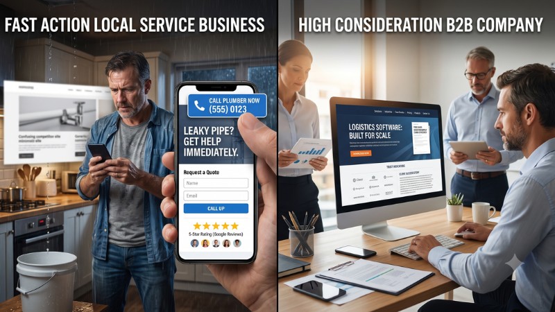
Let us start with local service businesses. When someone searches for an emergency electrician at nine o’clock on a Sunday night, they are not looking for an artistic statement. They do not care about your brand color story or a slow video background showing your team drinking espresso. They have water leaking through their ceiling, and they need a human being on the phone immediately.
A few years back, I worked with a local roofing contractor who was adamant about having a sleek visual portfolio on his homepage. He wanted floating animations, custom typography, and a dramatic video header. We built what he asked for, and his lead conversion rate immediately dropped by thirty percent.
When we stripped all of that away, put a massive clickable phone number in the top right corner, added a simple quote request form, and placed five Google reviews right below the headline, his leads shot up. The principles of modern web design demand that you reduce friction above all else for local services. If your visitor has to click through three pages just to find your phone number, you have already lost them to a competitor who put their contact details front and center.
The High Consideration B2B Company
Now, compare that frantic homeowner to an operations manager looking for enterprise logistics software. The buying process here is entirely different. A decision maker in the corporate space is rarely making an impulse purchase on a mobile phone while waiting in line for coffee. They are researching at a desk, comparing three to five vendors, and preparing to justify their choice to a committee or a chief financial officer.
For this audience, immediate call to action buttons like Call Now actually perform terribly if placed prematurely. A prospective enterprise client is not ready to book a call during their first thirty seconds on your site. They need proof that you understand their industry, their operational scale, and their regulatory requirements.
In this context, good web design respects the visitor by organizing complex information logically. You need clear primary navigation, downloadable case studies, clear pricing tiers, and deep dive product pages. Your layout should build trust through clear architecture, research papers, and detailed customer stories rather than generic marketing buzzwords.
Building Helpful Friction on Purpose
Sometimes, complex business sites actually need more friction, not less. If you offer a high end consultation service that costs twenty thousand dollars, you do not want five hundred low quality contact form submissions every week. You want ten highly qualified inquiries from serious prospects.
By using multi step intake forms or requiring specific company details before scheduling a conversation, your site screens out bad fits automatically. That is a deliberate structural choice that protects your team while reassuring serious buyers that you run a professional operation.
Matching Your Web Design Strategy to How Customers Actually Buy
Understanding buyer psychology requires you to look beyond aesthetic beauty and focus on user intent. When you step back and evaluate your market, you will notice that every industry falls somewhere on a spectrum between impulse buying and deep evaluation. Matching your web design strategy to where your clients sit on that spectrum is what transforms a site from a digital business card into a revenue engine.
Ecommerce Versus Professional Services
Consider an online retail store compared to a specialized law firm. An online clothing store needs rapid page load speeds, high resolution product imagery, clear sizing charts, and a seamless checkout experience. Every additional form field or slow loading script costs real dollars in abandoned shopping carts.
On the flip side, a family law attorney or a corporate litigation firm operates on trust and reputation. A visitor looking for legal representation is often stressed and anxious. They do not want product carousels or flashy countdown timers. They want to see clean typography, headshots of experienced attorneys, credentials, and real testimonials that convey steady authority.
Three Cross Industry Mistakes I See Every Week
Despite these obvious differences across industries, I constantly see business owners make the same critical mistakes when planning their online presence.
Copying Tech Giants When You Sell Physical Services
The most frequent mistake is copying mega corporations like Apple or Stripe. Large tech companies can afford minimalist pages with single words and massive product photos because everyone already knows who they are. A local heating and cooling installer or a regional accounting firm does not have that luxury. You need clear messaging that states what you do, who you serve, and why you are qualified, right in the homepage hero section.
Hiding Essential Details to Look Premium
Another common issue is intentionally hiding helpful information, like pricing or service areas, in an attempt to seem exclusive. Unless you are selling custom luxury yachts, hiding basic facts frustrates modern consumers. Even if you cannot give an exact price, providing starting rates or estimated ranges establishes transparency and filters out unqualified visitors before they waste your time.
Over Engineering the Mobile Experience
Finally, many owners focus on how their site looks on a giant desktop monitor while ignoring how real human thumbs navigate a smartphone. Over eighty percent of local service traffic happens on mobile devices. If your mobile layout hides navigation behind confusing menus or fills the screen with popups, users will tap the back button immediately.
How to Choose the Right Strategy for Your Own Site
Before you start sketching layouts or hiring a developer, take an honest look at your business model and ask yourself three foundational questions.
First, what is the primary action a visitor must take to become a customer? Is it picking up the phone, filling out a form, buying a product, or booking a calendar slot? Build your homepage layout around that single goal, and remove every element that does not support it directly.
Second, what is the level of risk your buyer feels? Higher financial or emotional risk requires more proof, longer explanations, and prominent credentials. Lower risk requires speed, clarity, and minimal effort from the user.
Third, where is your audience when they visit your site? Are they on a mobile device while standing on a job site, or sitting in an office chair behind a desktop computer? Your answer dictates whether your overall web design budget should focus on mobile efficiency or desktop depth.
When you align your online presence with real human behavior rather than generic web trends, your business will naturally attract better leads and close more sales. Smart web design is not about looking expensive or winning awards, it is about creating a clear, effortless path between a customer’s problem and your solution.
0 Comments